
ClioVis creator, Dr. Erika Bsumek, an associate professor at UT-Austin, recently joined us on campus to lead a workshop on using ClioVis, an interactive digital timeline tool. Like TimelineJS and other digital timeline tools, you can plot points on a timeline, create summaries of those items, and attach images to them. ClioVis goes above and beyond these other tools in a few big ways:
- it’s much more interactive and allows users to create connections between items
- the interface is very easy to use
- it’s easy for students to collaborate in groups.
It’s clear that Bsumek is passionate about pedagogy and this is evident in the design and the thought she and her team have put into making it work to further students critical engagement with history. Because ClioVis has tons of great tutorials on how to use the tool, I just wanted to highlight a few things I loved about it here.
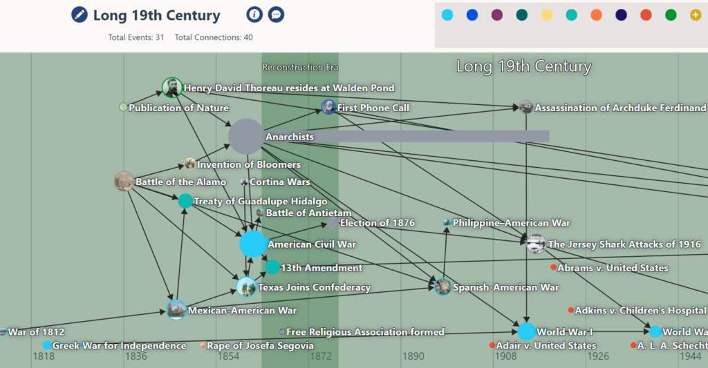
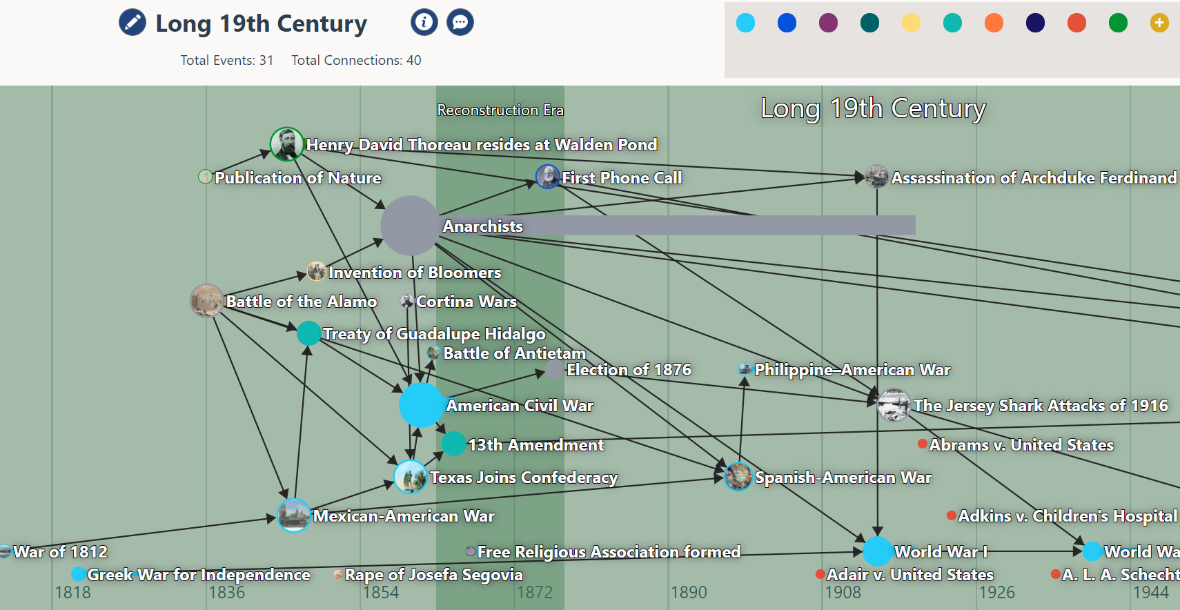
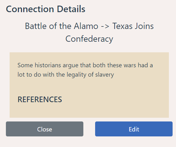
Interactive: One of the things I love most about ClioVis is how interactive it is. TimelineJS, for example, is essentially a powerpoint embedded into a timeline — it’s fairly unidirectional and doesn’t really encourage deep exploration. In contrast, ClioVis is interactive at its core. Although, like TimelineJS, it has a presentation mode (e.g. you can make more linear arguments), its main mode is a clickable, interactive timeline. Students can drag lines between items to make connections and then reflect on what links these events. This functionality fosters critical thinking as students work to find and articulate the relationships between the items on the timeline.
Collaborative: Since this tool is designed with students in mind, it allows for a lot of collaboration between students if used in the classroom. Multiple students can work on a timeline simultaneously (we were working with nearly 20 people in the room on one timeline during the workshop with no issues). It includes a built-in chat so that students can engage in discussion on the side or ask each other questions while working on the project from different locations. Students can build on each other’s work with this format in some ways that could be really productive. Bsumek, for example, asks students in a large Intro to Native history weekly in groups to map out key items from the textbook and work to draw connections between items collaboratively (e.g. what changed when Europeans came to the U.S. – how did this impact Native peoples?). This is a great way to use this tool, because if each student adds 5 items to the timeline and there are 5 or 6 students in the group, each student now has a much more robust list of events to build connections between.
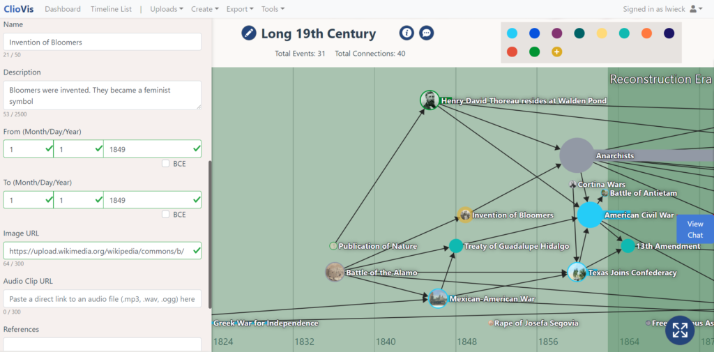
Easy to use: TimelineJS, for example, requires using excel and you don’t always see the fruits of your labor instantly. Teaching students to use it requires teaching them a variety of skills (albeit important skills), but it doesn’t really make it a plug-and-play option, especially for undergrad classes, and most of the KnightLab tools are not functional for collaboration. The ClioVis interface is really easy to use, and will function in ways familiar to most students who have used web tools. The tutorial videos on the ClioVis site will be great for students to reference if they forget how to use certain features. This has the potential of working well with all college students lower level undergrad and even high school classes.
Exportability: It’s also really easy to export all of the content from a timeline to a word document that lists all of the content, connections, etc., which would make this both easy to grade and easy to convert timelines into notes for studying and/or archiving.
Graduate applications: Bsumek also discussed that she’s used ClioVis with students to map out a particular historiography — how it has changed over time — and for students planning research projects to begin to build a timeline of the historical context. Both of these would work very well for this!
Areas for improvement: While I’m not familiar with the ins and outs of ADA requirements with digital tools, I suspect this doesn’t meet all requirements for accessibility, though the export to a Word document does make it machine readable. I also wish it could handle dates a little more nimbly — it requires a month, date, and year for all items (for both start and end date) though it only displays start and end year. I also wish there was a way to crop a timeline in the export process to only show the desired range of years.
Overall Assessment: This is an incredible tool, and one that is clearly a labor of love for Bsumek and her team. For an educational tool produced outside of a tech company, this tool functions really well, and it’s one that I’ll use in my classes to come. I’m so grateful that Prof. Bsumek was able to share this with us and our campus!